Friday, 24 January 2014

Evaluation: Question 4.


Audience Feedback from outside the cinema, after the screening of our music video:


Here is also a link to Vimeo where you can view my music video and the audience ratings.

Evaluation Question 4

What have you learned from your audience feedback?

Audience feedback is extremely important in determining how successfully our products connect with out target audience. Our main target audience was females in their mid teens to early twenties who can relate to Ariella because she is of a similar age and background. These girls would also be in awe of Ariella's style and appearance. Our wider target audience was slightly older people in general who simply like her music but also young males who find her attractive and enjoy watching her music videos.

At the cinema screening we tried to get responses from people from all areas of our audience so that the feedback was varied. 

This is a short documentary we made about the cinema screening:


My  thoughts on the music video feedback and what I have learned:


Audience feedback on my ancillary products:


My thoughts on the ancillary feedback and what I have learned:


Tuesday, 21 January 2014

Evaluation: Question 2.

Question 2: How effective is the combination of your main product (video) and ancillary texts (digipak and advertisement)?

A successful music video will make clear visual links between it and it's ancillary products...I think that my promotional package has clear visual links with my music video and the synergy is consistent. 

My music video:

Here is a link to my music video


What aspects of the video link with the digipak and advertisement?


  • Here is a link to Jessie J's video 'Do it like a Dude'. This video influenced me to have Ariella wear red lipstick throughout the video, as Jessie wears black lipstick throughout some of her video and it creats a powerful effect..
  • Here is another link to Rita Ora's video 'Shine ya Light'. This video also influenced me to have Ariella wear red lipstick and wear read nail vanish as Rita does in this video and it really stands out and looks good.

How successful do you think your main and ancillary products are? Do you think your target audience would be attracted to them?

I think that my music video and ancillary products are very successful. I incorporated the theme of red throughout my digipak and advertisement and my music video. I think that my ancillary products turned out really well and I achieved the professional look I was hoping for. I also think my music video achieved a professional look and I loved the end result. I believe the motif colour of red that we chose looked really good and we kept the synergy consistent throughout all the products. I think my target audience would be attracted to my products as there are clear visual links, for example; the red lipstick and red roses. However they may not be attracted to them because the wall that features in my music video is darker than the wall design I used in my digipak and advertisement. Overall, I am really happy with how my products turned out and believe they have all been really successful. 


Evaluation: Question 1.


Monday, 20 January 2014

EVALUATION QUESTION 1

In what ways does your media products use, develop or challenge forms and conventions of real media products ?
The Theories, forms and conventions 
 My final music video product definatly included carol vernalis throughout the making of my video.Our editing is cut to the beat giving it that rhythmic structure cutting in everything fourth or second beat. During the chorus, the editing sometimes gets faster as the tempo of the song speeds up, this reminds the viewer that it is the chorus as the shots are much faster and varied compared to the verses. I have used 3 main base-tracks which all include many base-tracks in the same area but from different angles such as high low and side angles to make the video look more exciting and engaging to the audience.This idea came from Jessie J's video domino where it is of herself in a certain place where she is filmed there in a bunch of different basetracks all in that one location, then the same in a different location.we wanted the editing to the beat to stand out most in the end of the bridge of the song where it cuts to lights looking like fireworks, we struggled with making it all connect so that on the exact beat, the fireworks would explode giving it much more of an impact to the video, but we got there and i feel that was successful.

 Relating to Andrew Goodwins theory, i have kept the structure of a music video, verses and chorus. Ariella plays more than one role as she plays the narrator, participant and also the character which is often the case in other music videos or they would have loads of people aswell as themselves.My artist Ariella looks a lot into the camera, breaking the fourth rule. I believe this helps to engage the viewer and makes them feel more involved as if the artist is directly including them. The music video takes the form of amplification as the video gives new meaning to the song but doesn't contradict the lyrics.The theme of the song is love which she potrays by the colour red but she is reflecting in a range of locations simply singing to the camera.

 Laura Mulvey beleieves women are represented as objects of a male desire, however we decided we did not want to include this so we had are artist dressed more covered up compared to a normal music video where a girl would dress more revealing.We did not include any dismemberment of the body which appears in the majority of music videos. Areilla is to come across as a role model to young teenage girls. However we did find it difficult to deflect the male gaze as the artist is styled accordingly in fashionable tight clothing for the skater part scene.
 To establish the closure of our video we decided to merge two footage's of the artist together and make them slightly opaque, then have it fade out to show it is the end of the video.

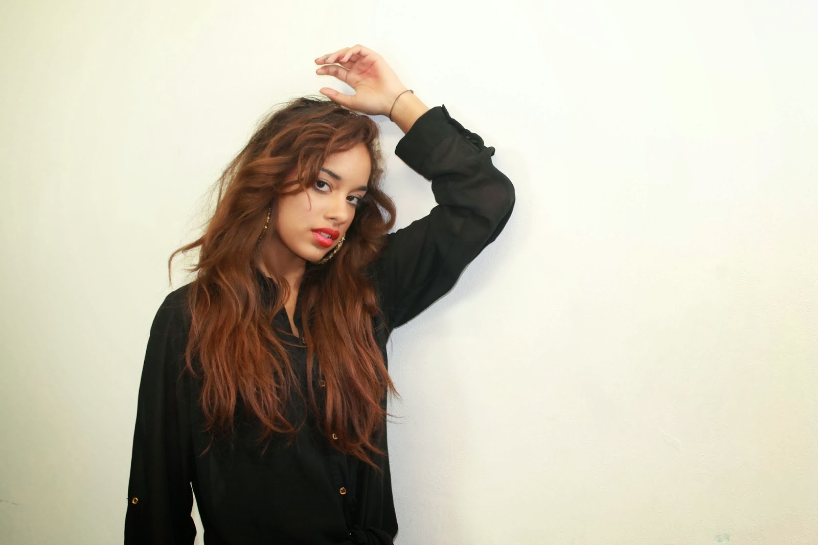
There was a distinctive motif chosen to stick by which was the colour red, Throughout every seen she has something red whether its her top lipstick or nails. That was what ariella is to be recognized by. This is also included into the ancillary product where ariella is wearing red lipstick to stay with the theme of red. This was influenced by Rita Ora, In a lot of her music videos she is seen to be wearing red lipstick which i thought made her stand out and i wanted that for Ariella too. Rita Ora also influenced us by er use of tracking in her video 'shine ya light'. she walks down a road while the camera tracks her which we decided to do for our scene on the pier. She used a blur effect in this video also which we decided to use in our introduction of our video, Ariella walks by the camera with only her heels visual, it starts of as very blurry then goes into focus. We thought this was a perfect way to start our video as it is like the viewers are now seeing the light in an amazing video, as blurred into focus normally appears when something good is involved so we hoped this would make the viewers beleive more that they are in for a treat by watching the video.

For ariellas costumes, the number of outfit changes was influenced by jessie j's dominos video also. We had to be careful with the colours as for out skater scene, if we had our artist in something too bright, it would just clash against the many colours involved in the graffiti, so we decided just to have her in black. This made it easier to see our artist visually aswell. This video is very simple, however the influence of jessie j's video gave us the idea of using different shots with the camera such as high angles low angles close ups and long-shots which jessie j incorporates in her videos, we believe this is what made our video more complex and less boring.

The ancillary product, i beleive, was very succesful as it followed the conventions we learnt of. It included all relevant information such as the bar-code , record label, website and the copyright information. I have used 2 main fonts so that it is all easier and readable, and i have used 2 colours for my CD cover; black and white. and for my advertisement i used 3; black red and grey. Clear shots of the artist were used for the 2 products. For the Cd front cover there is a large close up of Ariella which was inspired by kesha's CD front cover and for the inside there are 4 pictures of her. Sometime artists write a personal message or messages to fans, however instead i decided it would be best to have pictures of her as she is still not well known so the more pictures of her, the more likely, whoever buys the cd, will notice her face. On the back of the CD is the relevant song list which appears on every Cd. However for the advertisement i think there are different priorities, such as mentioning when the cd is out , where is is available to buy and anything that will make her album stand out such as featured guests and comments of well known music magazines. We have put the HMV and iTunes logo's, they are very well known and artists albums are always bought there so we thought they were relevant purchasing places. To make sure there was no white space on the advertisement, there is another picture of the artist placed on the side, it is large and clear so buyers know who it is. There is also a picture of the album itself as people would need to know what they are looking for if they want to buy the album.
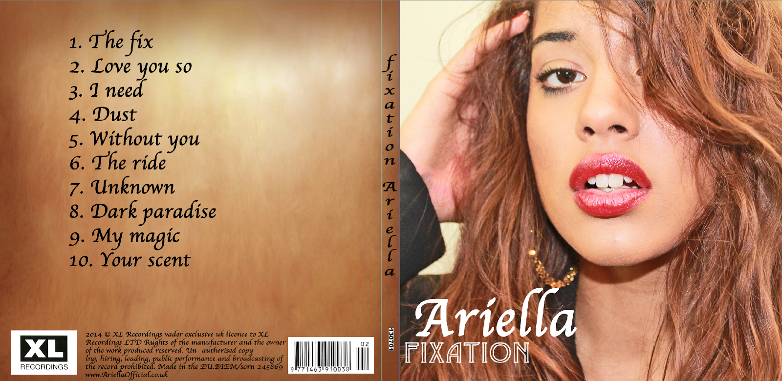
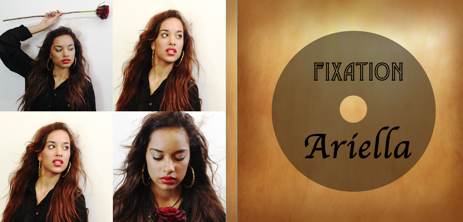
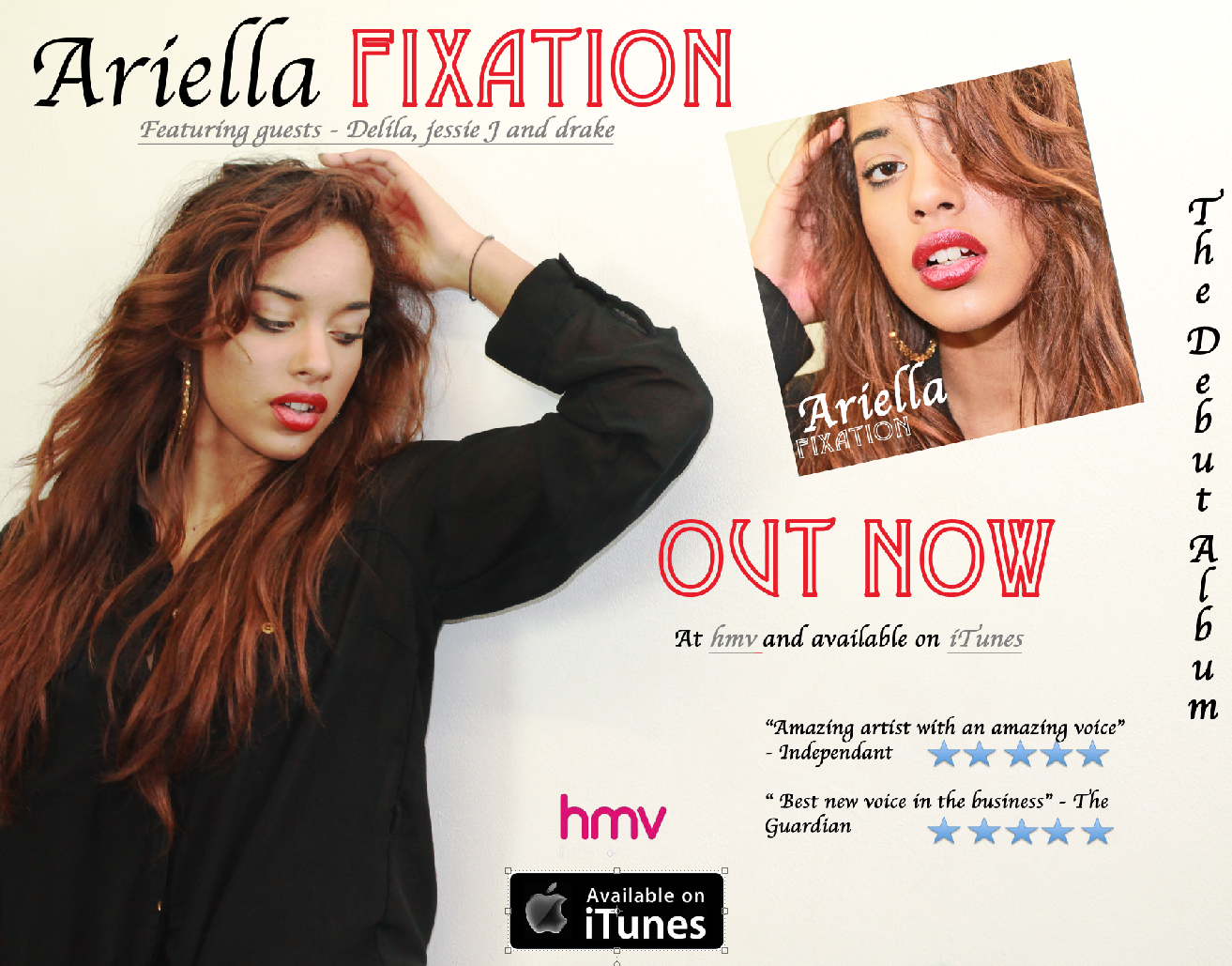
Audience Feedback on my DigiPak and Advertisement.

Sunday, 19 January 2014

My Final Ancillary Products.

UMy Final Ancillary Products
(DigiPak and Advertisement)

Outside Panels of DigiPak:


Inside Panels of DigiPak:


Advertisement: 


Saturday, 18 January 2014

Evaluation Question 2

How effective is the combination of your main product (video) and ancillary texts (digipak and advertisement)?


Set 1:


Set 2:


Set 3:


Set 4:


Thursday, 16 January 2014

Evaluation Question 1

In what ways do your media products use, develop or challenge forms and conventions of real media products?


                Our music video follows the key conventions of music videos well: 

  1. It follows a verse, chorus, verse structure
  2. It uses everyday locations (skatepark, on the streets, next to the river Thames)
  3. The artist puts on a performance
  4. Effects are used (slow/fast motion, blur effect)
  5. There is a lot of footage of the artist

Monday, 13 January 2014

Evaluation - Question 1

In what ways does your media product use, develop or challenge forms and conventions of real media products?


Powered by emaze

Evaluation - Question 2

How effective is the combination of your main product (video) and ancillary texts (digipak and advertisement)?


Evaluation - Question 3

How did you use media technologies in the construction and research, planning and evaluation stages?


Evaluation - Question 4

What have you learned from your audience feedback?


In case feedback videos don't load in Prezi you can view them by clicking links below:
- Cinema Feedback here.
- Target Audience feedback here.
- First Feedback On Editing here.

Sunday, 12 January 2014

Creating my DigiPak and Advertisment.

Teacher feedback on my DigiPak and Advertisement draft.

Teacher feedback on my DigiPak and Advertisement draft

After uploading my first draft of my DigiPak and my Advertisement, my teacher gave me some feedback:

I have took this feedback on board, and will make some improvements :)

Saturday, 11 January 2014

Production - the process of creating my digipak

I started working on my digipak before half term, this week I've put a lot of work in to getting it ready for the deadline (Monday the 13th). Over this process I've been collecting screenshots to keep my blog updated with how I've done everything. It's a bit late.. but here it is!


Although I didn't initially plan to use the Pentonville effect, after selecting my images I began experimenting on Adobe Photoshop. Since I had tried this technique when we had the Photoshop practice lesson, I knew exactly what to do.


I duplicated the image layer and converted the top layer to black and white, I then zoomed in and used the eraser tool to rub out the sections I wanted to show up in colour (Orrie's lips and the rose).


I spent quite a while experimenting with fonts on Photoshop. I initially wanted to use a graffiti style font, (the most suitable one I found is shown above) but I decided it didn't work well with the more subtle and feminine feel of the rest of the cover.


Eventually I chose these two fonts, the font of 'Fixation' is quite subtle and discreet due to the handwritten style, this allows the slightly bolder font of 'Ariella' to stand out more and comply with the convention that the artist's name should have more focus than the album name. To make sure there is enough focus on the album name I have chosen for it to be red and the artist's name to be white. This also creates a good colour balance rather than using one colour for both pieces of text.


In my mock up I planned to have a red graffiti pattern on the middle section of the digipak, I took a black and white image and put a red colour filter on it, this worked well however I decided not to use it because it looked too fussy and didn't match the rest of the digipak. This is how I designed the middle panel in the end:


I decided that in my mock up the right hand side inside panel looked too plain so I chose this image of Orrie and used the Pentonville effect again.


Above are a few screenshots showing the process of picking out the red colour.


To achieve the accurate alignment of the three pictures on the left side of the inside panel, I had to use the grid feature to crop adjust and then align the images next to one another perfectly.


At first I used the same handwritten style font of  'Ariella' for the copyright information, My audience members said it looked too busy which I agreed with so I have now changed it to a much simpler font.


Friday, 10 January 2014

Audience and Teacher feedback and the changes I will make

I've asked two audience members and one teacher for feedback on my first drafts of the ancillary work to get some ideas on what I should change to make sure my products appeal to my target audience...

Audience member 1:

  • Good quality of pictures 
  • Likes the contrast of the red with the black and white
  • The ancillary work corresponds well to the mood of the genre and video, (intense and quite sad) 
  • Thought the picture under the CD on the right side of the inside panel was very striking and effective, also liked the simplicity of the inside panels 
  • Likes the positioning of 'Ariella' and 'Fixation' on the advert 
  • Could make the red of Orrie's lips the exact same colour of the red font using the eyedropper tool
Audience member 2:

  • Colour scheme links well to the video 
  • The simplicity of the look of the advert so far is simple yet effective, the two images of the artist work well together and it clearly relates to the digipak
  • The stylised font of 'Fixation' is quite hard to read
  • The copyright information on the back cover could be in a more simple text because it is very hard to read
  • Should consider adding another element to the left inside panel because it looks a bit plain
  • 3 fonts might be too much on the advert, consider using only 2          


Teacher:     

  • The use of makeup emphasises the theme and feel of the artist as a brand very well
  • The colour scheme and images used are striking which is very important and the basis of a good product 
  • The exterior panels, inside panels and advert work well together and show strong cohesion
  • 'Fixation' on the front cover of the digipak should be bigger and bolder
  • The production company logo on the digipak is too big
  • The barcode is also too small
  • Could include some thank you's from the artist or quotes from lyrics of tracks from the album on the left inside panel of the digipak because it looks a bit plain above and below the three photographs                                           


What changes am I going to make based on this feedback?


Wednesday, 8 January 2014

Wondering about my advertisement :/

Today I've been working hard on photoshop to get my advertisement done, I couldn't help doing a bit of research for further information...

I've been comparing landscape and portrait advertisement:


Portrait advertisements normally use one picture of the artist which covers the whole page


Landscape advertisements often have a midshot/longshot photograph of the artist as the background and then have the album cover featured in small

This would work better for me because I have a lot of really good mid-shots from the photo shoot which I would like to use. I've adapted my ideas and tweaked this a bit so that I can produce a landscape advertisement.


First draft of DigiPak and Advertisement.

Outside Panels

Inside Panels

Advertisement 

A minor change

In the original picture i had a nail that was blue, however i now used photoshop to edit the nail red so it doesnt look so out of place. ( the middle finger )

The Pentonville effect and where I'm at so far

So here is what I've produced so far...


Front panels


Back panels


I'm happy with the outcome of both the exterior and interior of my digipak, although it looks quite different to how I initially planned it. The colour scheme was so effective that I decided to use


THE PENTONVILLE EFFECT

I have used this effect to draw attention to my motif of red 


ADVERT

I haven't quite finished my advert. So, what do I still have to do? 
  • Include other logos and websites of places that the album is available at
  • Include Ariella's website
  • Add some reviews (find suitable magazines)
  • Add XL Recording's Logo 
  • Add some extra information e.g 'Includes the hit singles ...'


first draft of ancilary product


Tuesday, 7 January 2014

Font, Colours and Layout ideas.

Font, Colours and Layout ideas

Location of DigiPak pictures.

Location of DigiPak Pictures

For my DigiPak pictures, I decided to do a photo shoot in a photography studio with a white background. I decided to do this as  I wanted my audience to focus on Ariella rather than a location. I have lots of close up shots of Ariella's face and some nice mid-shots. Another reason for using a white background was so that the rose that is featured in some of the shots is more noticeable; as it may not have been if I used a location with lots of colours in it. I also used some of the lighting available and a fan to make the pictures stand out more.

This photo is very similar to the photography studio I used: