Friday 27 December 2013
The Text Survey (research) ...
So... I've conducted a survey asking members of our audience 3 questions:
1. How do you usually buy music
2. Is artwork important to you?
3. What do you expect from a digipak?
I asked these questions over text because it means I can reach a number of people I know who I think would be part of our audience. Here is a tiny bit of background information about the audience members I questioned...
Audience member 1: 14 year old girl
Audience member 2: male in mid 20's who is in the music industry
Audience member 3: 17 year old male
In conclusion, although the two younger audience members made it clear that they appreciate and support their favorite artist's music, it was unlikely and rare that they would pay for a physical copy of a CD or an MP3 download. The slightly older audience member who is involved in the music industry always pays for his music, and seems to have high expectations of the digipaks of any album he buys.
The 17 year old male wasn't bothered about the artwork but in general the audience members agreed that artwork is important when investing money in the product, it also defines and presents the artist in a certain way.
My survey has made it clear that artwork is STILL important for a number of audience members most probably the minority or even niche audience in some cases but nevertheless it is an opportunity that shouldn't be missed to convey the artist's image and style as well as generate profit. It seems that some people are willing to pay high prices for these products, as audience member number 2 said that he usually buys the deluxe edition of a CD and goes all out!
Wednesday 18 December 2013
CHANGES !
 |
| image 1 |
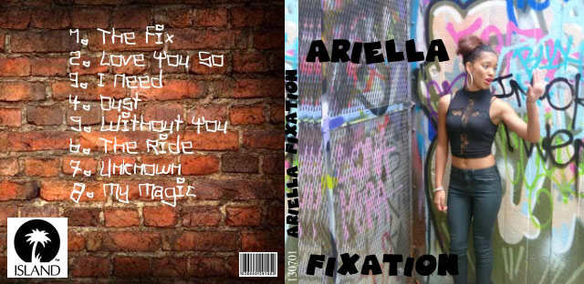
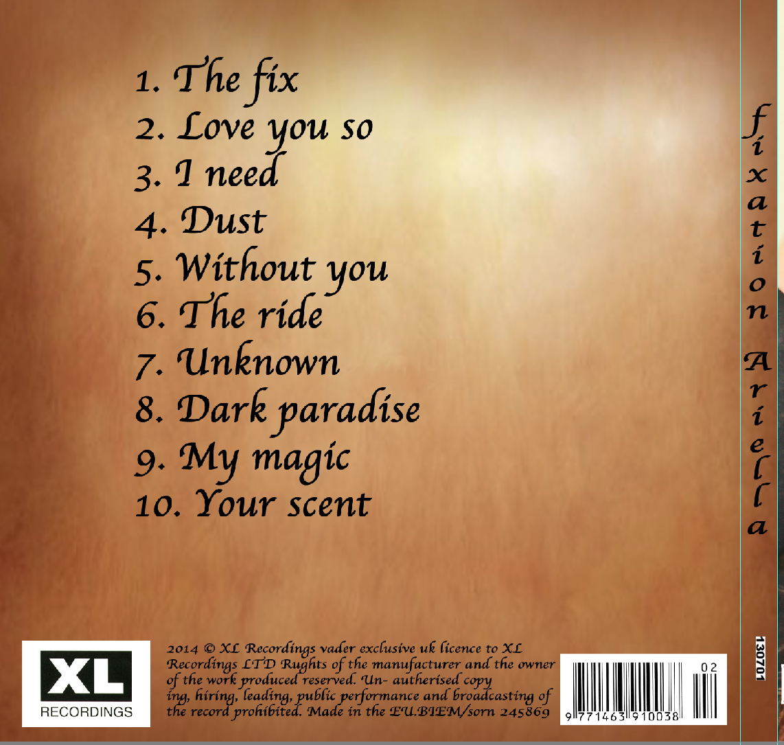
so initially my first idea was as demonstrated above in image 1. i wanted my cd cover to look more graffiti so i used the chalkdust font and has a graffiti'd background. however i realised if i kept the background, it would be really hard to read the list of songs. therefore i decided to change the background to something plainer. I also decided to change the font into something more girly as i realised her image is not all just about graffiti. Initially i had black font however it was hard to read as the artist is wearing black, hense forth i changed thr font colour to white and also changed the album name ' Fixation' into a different font.
Changes
To begin with, i wanted my advertisement to look a lot different to how it is now. i wanted it to have a full on picture of me in the middle with writing on the top and bottom. Now however i have chosen a picture of myself and used the rule of thirds and put it to one side of the page. on the rest of the page i have included all the relevant information.
Ancillary production Pitch
Pitch in a lift
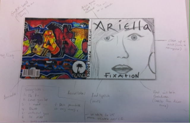
- For my Digiak and advertisement , ive decided to use 4 panels. For the front cover of my CD cover i will have a close up of the Artists face along with her name and the name of the album in the font called chalk dust. On the back id like to have a graffiti background with the song list, record label, barcode and an artists website. For the inside panel opposite the CD i will have a collage of 4 OR 6 images of my artist, with one consisting of the artist holding a rose as im making it a main theme. For the CD part itself i want on the CD to have a rose and the album name; Fixation. the CD will be black with white font and the background of that panel will also be in black.
- I would like to stick with the theme of the rose and the colour red involved, as she is an urban artist id like the to have a graffiti background as it is also in the video we made. Shes got that urban style so id like for her photo's to look quiet feisty but also i want her to look sad and happy due to the fact most of her songs are about love which brings out both emotions.
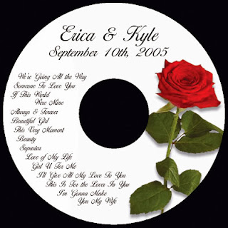
- For the cd style, i chose this because when i was searching up cd's with a rose on it a great one popped up which was plain, had the album name and a simple rose on it
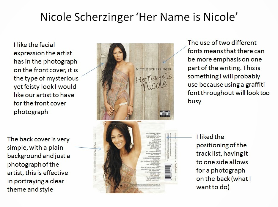
I like the close up of this cd cover so i want ours to be a close up of the artist aswell .
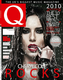
- i would say the closest magazine that my artist would appear in would be 'Q' . It includes the most recent and known artists such as rhe weekend , 50 cent and Cheryl Cole. I believe Cheryl Cole would be alot like our Artist therefore i think it would be perfect.
Tuesday 17 December 2013
Ancillary Production Pitch.
Pitch
For my DigiPak and Advertisement, i have decided to have 4 panels. On the outer panels i will have a close up of my artists face; i want the artist to be looking directly into the camera with a feisty look on her face, reflecting the urban fell we tried to portray in our music video. The back panel on the outside will be of a brick wall with the song list, barcode, record label, artists website etc. On the inside panels i will have a red rose where the cd will be and on the other panel i will have a collage consisting of four pictures of my artist. I am going to stick to the theme of red which i had in my music video, I've decided to have the brick wall on my outer panel as i have a brick wall in the video and the colour of the wall compliments the artists hair colour really well. I have got my ideas for my digipak from looking at real artists digipaks such as Rihanna, and also i wanted it to stay true to the music video. My advertisement will be placed in 'Hip-Hop' magazine and will have a full page feature. I have decided to go with this magazine as its urban and fits the style and theme i have decided to go for, for my own digipak and advertisement.
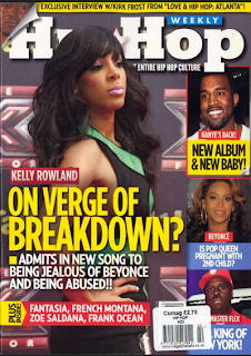
An example of 'Hip-Hop' magazine:

Location for digipak pictures
The location I have used for my digipak photos is a photography studio which looks very similar to the picture below. The reason for this is that I wanted pictures that focus very much on the artist's face and actions rather than a location. The professional lighting and white background helped me achieve this look, the white background will allow me to dull the colour in to the grey hue I want to create. The lighting and simple location of my photos brings attention to the artist and the rose when it is featured.
Monday 16 December 2013
Artist's costumes for digipak
We have purposely kept Orrie's outfit very simple for the photo shoot. Orrie wears all black which makes her stand out on the white background (this will work well with my colour scheme or black, red, white and grey as I plan to have a light grey background). I have kept the synergy displayed in our music video through her red lipstick and the hoop earrings she wears in some pictures.
We have kept to one outfit in the pictures, this means that my digipak won't look too busy, as I plan to use more than one picture. However, I have created some variation in the styling: in some pictures her hair is tied up, in others it is down, sometimes she has the hoop earrings on etc.
We have kept to one outfit in the pictures, this means that my digipak won't look too busy, as I plan to use more than one picture. However, I have created some variation in the styling: in some pictures her hair is tied up, in others it is down, sometimes she has the hoop earrings on etc.
Sunday 15 December 2013
Photos for digipak
Here is a snapshot of some of the pictures I have taken for the digipak. I have tried to capture Ariella's feisty attitude aswell as reflect her slight vulnerability through her facial expressions especially in the pictures which feature the red rose as a prop.
We used a white background to contrast the black outfit which will enable the whole group to individually edit the photographs to work with our own ideas for our ancillary work.
Saturday 14 December 2013
Where my ideas have come from?
After looking at a number of digipaks I gathered quite a few ideas that have influenced my planning from these two albums...
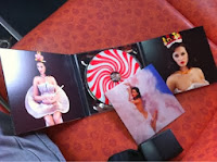
Another digipak that really inspired me in terms of the overall look and feel is Rihanna's 'Loud' deluxe edition
I love the boldness of the red throughout the digipak - this has made me eager to highlight the red in some way through my ancillary work since it is meant to be the main aspect of synergy within all three media products.
Initially I didn't plan on using a rose within the ancillary work but it works so well here that I've been tempted and will take some pictures of Orrie with a rose so that I can experiment on Photoshop.
Practice / Mock-Up Digipak
Practice / Mock-Up Digipak
Here is my first practice / mock-up digipak, not sure about the font I used to write the song list, maybe a little hard to read, and couldn't find a decent looking font for the artist and album names.
So here is the outside
Here is the inside
Feedback: I've got some feedback from my teacher, overall everything is fine, I only missed a couple of minor things which were the artist's web page and small print copyright stuff. I was always suggested to make the artist's name bigger than the album's name.
Wednesday 11 December 2013
quick updated mock up
Here are my updated ideas for my digipak after doing a bit more research and pulling my ideas together.
Analysing Digipaks and Advertisements - Part 3/3
Analysis of Three Digipaks and Advertisements
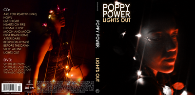
The third digipak I chose
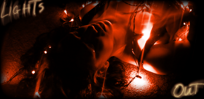
The advertisement shares same style as the digipak, same font and colors have been used, with a picture of the artist in the dark. The only thing I didn't like about the advertisement is the picture of the artist on the right, it looks like it has been enlarged for the advertisement and looks a little blurry.
The digipak uses clear and standing out fonts which are easy to read. In my opinion the colour of the writing goes really well with the dark background, the white and dark yellow is standing out from the dark background. The picture used for the inside is good, but I don't think it will look good with the CD, it will cover the whole right part and probably a bit of her head, chin and mouth. All the common things are used, bar code is there, the small print copyright stuff is on there, looks good. The only bad thing I noticed on the front panel is that the picture of the artist was taken in the dark, and you can hardly see the artist's face, when it should be clear and advertise her look.
The advertisement shares same style as the digipak, same font and colors have been used, with a picture of the artist in the dark. The only thing I didn't like about the advertisement is the picture of the artist on the right, it looks like it has been enlarged for the advertisement and looks a little blurry.
Analysing Digipaks and Advertisements - Part 2/3
Analysis of Three Digipaks and Advertisements
Second digipak I chose
The thing I like about this one is that it is very consistent on the font used, I like how the colours are very similar, especially on the back panel, the writing is grey just like the background yet it is still easy to read, and looks really good. Also the colour of the writing is the same as the colour of what the artist is wearing. Barcode and all other information is on there. The only thing I really don't like about this digipak is the photo on the front panel, I don't think artist's expression is appropriate even though it's related to the video I think there should have been a different photo of the artist. Also I don't like the 3 lines going across panels, it's like they thought it was too empty so they just randomly stuck something random on it, I think it would have looked better without it.
Here is the advertisement for the digipak
The font and style stayed the same as the digipak, that's good. The thing I don't like is the light blue background they used, it's not related to the digipak, and it does not look good on here. In my opinion a grey background like on the digipak would have looked good on the advertisement too. Also you can see how badly the lines were stuck together, there are little gaps left in between them which shows that photoshop was a problem.
Analysing Digipaks and Advertisements - Part 1/3
Analysis of Three Digipaks and Advertisements
First digipak I chose
This digipak has clear font, simple colours, and size, it is appropriate to the genre. In my opinion it should have had same font colour on the side panel as the from one. Also the inside panels in my opinion are too empty, maybe the artist should have warn different clothing, lighter, so it would stand out from the dark background.
This is the advertisement for the first digipak
The good thing about this advertisement is that it kept the same style as the digipak, the font is exactly the same, and it used the same black background as on the digipak. Very good font size differences, the white big "OUT NOW" stands out well as it should. I actually can't think of any weaknesses here.
Tuesday 10 December 2013
2 things i have learnt about digipaks so far ...
From looking at previous digipak designs i think the two most important things ive learnt is;
- It is vital to have a clear image of your artist so people are able to easily recognize that this is their album. - - The font should always be easily readable
for example
- It is vital to have a clear image of your artist so people are able to easily recognize that this is their album. - - The font should always be easily readable
for example
In Jessie J's digipak, the picture on the front cover is very clear and we can establish it is her album. However in my opinion i feel that the writing on the front cover is bad as you cant see the name of the album underneath.
Examination of a real artists digipak
This is Ellie Gouldings Digipak. On the front cover there is an image of her face with her name and title of the album in the same font.Her name is much bigger than the title which is good. For the back there is also an image of her but it is to the right and the song list is on the left with the same font as on the front cover.It contains the barcode record label as well.The inside panel, on the CD side has a picture of her on he CD with the name of the album and her name, all in the same font consistently. For the other side of the inside panel there is another image of her playing a guitar and singing, its not too complicated and looks professional.
Here is Marina and the Diamonds Digipak.For her front cover she has a picture of herself with a blurred coloured background. There is the name of the artists name and album name both in the same bold black font.For the back of the cd cover there is the song list in the same font and there is a picture inthe background which has been reflect and has also got a blurred effect. It contains the barcode record label and website.For the CD its an image of herself with the same blurred image effect of her which has been used in the other panels. it also has the title and the name of the artist in it.For the panel opposite there is also an image of herself with the words 'BLAH BLAH' in a pink and blue effect.
Where my ideas have come from
-For my inside panel, on the cd part i wanted to have a red rose with the artists name in white while having a black cd instead of white.
-In the inside panel opposite my cd , i want a either one picture of my artist or 4 small ones depending on how good the pictures are.
-I am using this picture for inspiration for my front cover. il have a close up of the artists face with the name of the album and the artist.
-I want my songlist to be similar, with white writing but i would have a graffiti background . it will contain the relevant info such as barcode, website, and record label
Subscribe to:
Posts (Atom)





.jpg)


.jpg)
